
Understanding how product visuals influence sales starts with one behavioral fact: in an online store, your product images are the product until the box arrives at the customer's door. In the Baymard Institute's large-scale usability testing, 56% of users' very first action on a product detail page (PDP) was to start exploring the product images.
When your gallery visuals are sharp, consistent across every colorway, and show true scale and construction details, shoppers can judge the product with more confidence before they decide to check out.
Here is what usability research, platform data, and industry surveys show about how product visuals drive (or kill) online revenue—and why more brands are using 3D product rendering as the lever to produce complete galleries without the bottleneck of repeated physical photoshoots.

The Hard Numbers: How Visual Gaps Cost Online Stores Sales and Returns
Store owners often assume that if a product is well-engineered and competitively priced, customers will forgive an average photo gallery. Independent ecommerce benchmarks show the exact opposite:
1. First-Impression Trust and Zoom Abandonment
Baymard Institute's image resolution and zoom benchmark found that 25% of ecommerce sites provide product images that are insufficient for shoppers to inspect a product—14% because of low resolution and 11% because the zoom level is too limited. On mobile, an earlier Baymard benchmark of 50 top-grossing U.S. mobile sites (mobile gesture research) found that 40% didn't support pinch or double-tap zoom on product images.
2. The "In-Scale" Blind Spot
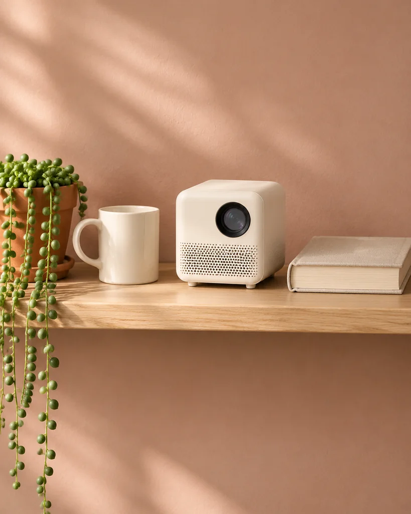
Shoppers rarely pull out a tape measure to read text dimensions in a specification tab. According to Baymard Institute's research on in-scale product images, 42% of users try to gauge a product's overall size directly from its gallery images—yet Baymard's 2017 benchmark found that 28% of sites didn't provide any in-scale image (showing the product in a room environment, on a model, or beside a familiar reference object), and its later product page benchmarks still list missing in-scale images among the most common gallery gaps.
3. Missing Variant Images and Lifestyle Context
According to Nfinite's 2023 survey of 1,074 U.S. consumers (The state of the shopper in 2023, summarized by the Home Furnishings Association). Nfinite sells CGI imagery, so treat these as directional survey results rather than measured sales data:
- 88% of consumers say product imagery is important when shopping online.
- 65% of consumers are more likely to purchase an item when they can see it from all angles.
- 69% of consumers say a contextual lifestyle image (seeing the product inside a realistic room or setting) is more likely to capture their attention than a standalone white-background cutout.
- 56% of shoppers say they are less likely to buy furniture if no or limited imagery is available for the exact color or finish they want to order.
4. Search Clicks, Returns, and Repeat-Buying Intent
Visual completeness affects both the top and bottom of your funnel:
- More clicks before they even reach your site: According to Google Shopping Solutions' feed optimization data, product offers with more than one image see a 76% average increase in impressions and a 32% increase in clicks in Google Shopping feeds. These are averages for impressions and clicks reported by Google—not a guaranteed increase in sales, and results vary by category and feed quality.
- Fewer returns and lost customers after checkout: In the same Nfinite survey, 83% of consumers said they would return a product if the online image didn't match what arrived in the box—and 72% said they would be less likely to shop on that site again after a visual mismatch.
The Complete Product Page Visual Checklist (What Every SKU Needs)
To turn browsers into confident buyers, a product gallery cannot rely on two or three generic front shots. Every core product (SKU) in your store should answer the visual questions that apply to it—these six cover most stores:
| Gallery Slot | What the Image Shows | The Buyer Question It Answers |
|---|---|---|
| 1. Hero Packshot (White / Neutral) | Crisp three-quarter or front studio view with clean contact shadow. | "What exactly is this product, and how does it compare to others in the collection?" |
| 2. Front, Side, and Back Views | Front, back, side, and top/bottom views showing ports, latches, and seams. | "How is it put together, and where are the connections or openings?" |
| 3. High-Resolution Macro Crop | Close-up zoom (e.g., 3000 × 3000 px+) on material grain, brushing, or stitching. |
"Is this real brushed aluminum and full-grain leather, or cheap plastic?" |
| 4. In-Scale / Dimension Graphic | Product shown beside a familiar scale anchor or with clean millimeter callout lines (Baymard Descriptive Graphics). | "Will this fit on my counter, in my bag, or through my doorway?" |
| 5. Contextual Lifestyle Scene | Product staged inside a natural, well-lit room or use environment. | "How does this look and feel in a real space like mine?" |
| 6. Dedicated Variant Views | Every selectable colorway or finish shown in the exact same angles. | "What does the 'Warm Bronze' option actually look like before I add it to my cart?" |
Not every product needs all six—simple, low-cost items may need fewer, and complex or high-value products may need more—but any slot you skip is a question the shopper has to answer by guessing.
We break down how to plan these exact views before production starts in our studio guides on building 3D product image shot lists for ecommerce and choosing white, transparent, or environmental backgrounds for product renders.
Why 3D Product Rendering Is the Practical Lever for Store Owners
Many ecommerce managers already know their product pages would sell better if every SKU had 6 high-resolution angles, a macro texture shot, a dimension graphic, a lifestyle room scene, and complete imagery for every colorway.
The reason stores fall short is often the logistics of physical photography:
- Shipping 40 physical samples across the country (or waiting until factory mass production finishes before you can shoot a single marketing image) can delay launches by weeks.
- Renting a physical kitchen or living room location—and hiring a set stylist, lighting crew, and retoucher—every time you launch a new appliance or chair can quickly push the marketing budget up.
- Trying to "fake" new colors by tinting a JPEG in Photoshop looks unnatural because flat color overlays cannot change how light reflects off matte powder-coat versus brushed brass or velvet fabric.
3D product rendering (CGI) removes most of that logistical ceiling. It does have its own upfront cost—building and approving a master model—so photography can still be the simpler choice for a single, simple SKU in one finish that you already have on hand. The more variants, angles, and launches you have, the more the 3D approach pays off:
- Shoot before the factory ships: Because a 3D studio can build your product model from engineering CAD files or early prototype photos and measurements, you can render your entire launch gallery while inventory is still on the water. Before those images go live, compare them with the first production sample and update any finish that changed.
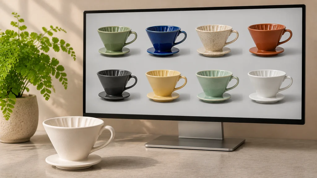
- Every colorway gets a real studio render: Once your master 3D model and virtual studio lighting rig are approved, rendering 10 color and material finishes across 6 camera angles is a clean, repeatable digital process. A Coresight Research report featuring Nfinite (a CGI provider) put CGI at 63% quicker than traditional photography for producing product visuals, and BigCommerce describes how Target, after building 2,000 photorealistic 3D models, reduced costs by 70% compared with traditional photography and cut its go-to-market time by 75%. Your own savings will depend on how many SKUs and variants you have.
- Consistent catalog framing: In a virtual 3D studio, camera height, focal length (such as an 85mm lens with minimal perspective distortion), and softbox lighting are saved as exact numerical presets. A product you launch two years from now can be rendered in the exact same studio setup as the rest of your collection.
- One master asset can unlock 3D, AR, and animation later: Unlike a folder of flat camera JPEGs, the reusable 3D model built for your still renders can form the basis for an interactive 3D viewer file, a mobile AR preview, or a short product animation whenever you are ready. This is not automatic: the AR version is an optimization of the render model—simplified geometry and adjusted textures prepared as its own step—while a model requested for AR only from the start is built for AR directly.
Frequently Asked Questions About Product Visuals and 3D Rendering
Can shoppers tell the difference between a 3D product render and a real photograph?
Usually not, when the 3D model is built with accurate geometry (including real edge bevels and seam gaps) and shaded with calibrated physically based rendering (PBR) materials. What matters more than "passing as a photo" is accuracy: check every render against a physical sample or approved material swatch, so the image matches what actually arrives in the box.
What image resolution should we use on our ecommerce product pages?
Baymard Institute's research doesn't set a pixel number, but it shows shoppers need enough resolution to zoom into real details. A practical approach is to render master product visuals at 3000 × 3000 px to 4000 × 4000 px, then serve optimized WebP or AVIF versions on the storefront. On Shopify, product images can be up to 5000 × 5000 px and under 20 MB, and Shopify notes that 2048 × 2048 px usually looks best for square product images.
Should our main product image have a white background or a lifestyle background?
Use a clean white or neutral studio background for your primary catalog grid and hero image so shoppers can compare shapes and finishes across your range without visual clutter. Marketplaces set their own rules: Amazon's main image must sit on a pure white background (RGB 255, 255, 255), show the actual product being sold, and exclude illustrations, so check your category's image guidelines before using a render as the Amazon main image. Google Shopping recommends a white or neutral background for the main image and doesn't allow text or overlays on it. Use lifestyle renders in your additional image slots.
What if we only have one physical sample and 8 unmanufactured color variants?
That is one of the best use cases for 3D rendering. We model the product from your single sample (or CAD drawings) and use material swatches or finish references to render all 8 colorways with identical studio lighting. For colors that don't exist yet, approve each finish against a physical swatch or strike-off before the renders are published.
Ready to Upgrade Your Product Pages With Studio-Quality 3D Renders?
If you want this done for your products—whether you need crisp white-background packshots across every colorway, high-resolution macro detail crops, or custom 3D lifestyle scenes without the hassle of shipping prototypes to a photo studio—explore our 3D Product Rendering Services. Every render is built with lighting, materials, and camera compositions that make physical products read clearly and honestly on screen.
Tell us what products you sell and which views your gallery is missing.
Get a Free Quote ↗