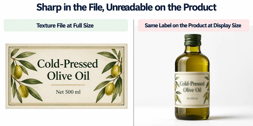
Separate essential product information from decorative small print. If a buyer needs the text to make a decision, provide an accessible text presentation outside the 3D image as well. A texture should not be the only place that information exists.
Define what must be readable
Identify the required label and the viewing state in which it must be readable. A logo recognizable in the default view is different from a specification panel intended for close inspection.
Save a fixed camera and viewport size for the test. Camera projection affects how much of the image the label occupies. Do not compare a desktop close-up with a mobile overview and attribute the difference only to the texture.
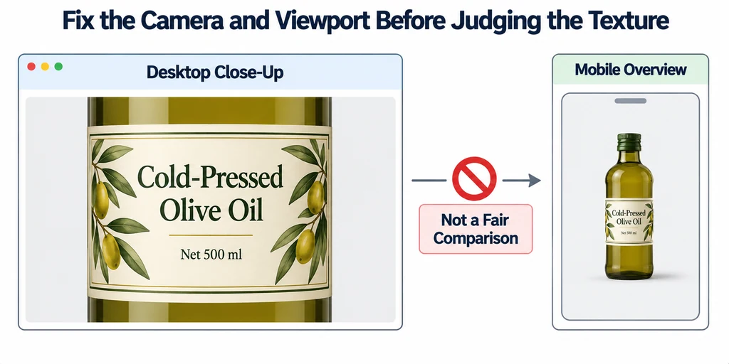
Inspect the final display size rather than relying on a magnified development screenshot.
Check the source and its allocation
Open the source artwork at its actual raster dimensions. Look for prior resampling, weak contrast, halos, or compression artifacts. A larger export cannot restore detail absent from the source.
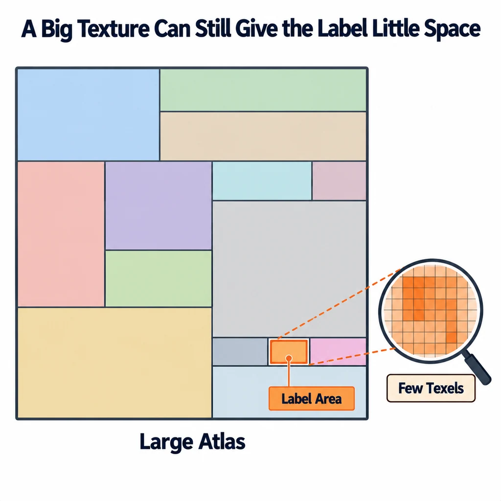
Inspect the UV area assigned to the label. A large atlas may still give the graphic very few texels. Reallocate space or use a separate approved treatment when needed, while checking the delivery cost.
Confirm that the label is mapped to the intended surface without unwanted stretching. Compare letter shapes with the approved artwork, not merely their apparent sharpness.
Inspect the oblique view separately
View the label head-on, then rotate the product. If it fails mainly at a grazing angle, investigate texture sampling. The Three.js Texture documentation describes minification, magnification, and anisotropy controls.
Do not disable mipmaps as a blanket fix. A still crop may appear sharper while the moving view becomes unstable. Compare the label during a slow camera move and at several useful distances.
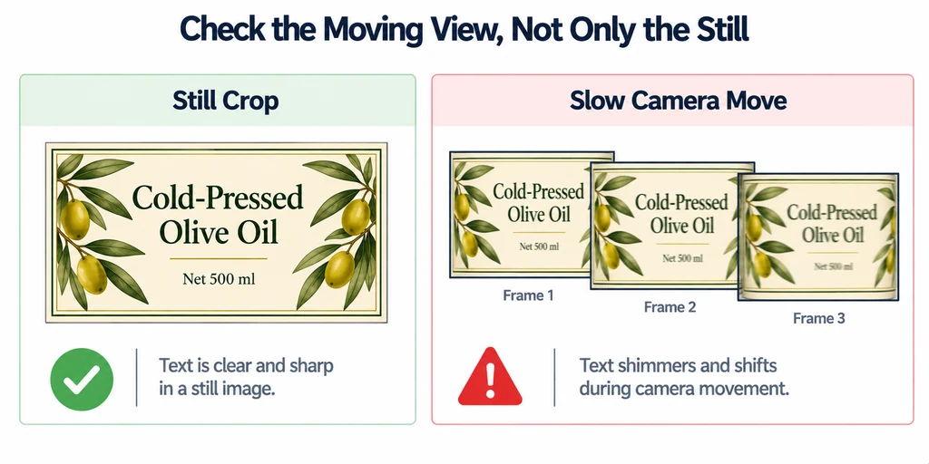
Change one sampling variable at a time and record the target device. Higher settings have a cost and should be tested in the actual experience.
Change the bottleneck that the comparison reveals
Begin with the source artwork, then inspect the label's UV area and screen coverage. If a label receives only a small region of an atlas, increasing that region's allocation may help more than doubling every material map. If the lettering occupies too few display pixels, more texture resolution alone cannot make it readable.
Anisotropic filtering can improve sampling at oblique angles where supported. Compare a modest setting and the device-supported limit during motion, retaining mipmaps and the same camera. Choose a measured setting rather than assuming the maximum is free or universally necessary.
Keep the printed artwork and physical proportions intact. When the required information is too small in the default view, supply a named close-up and accessible text. Enlarging the product's actual label to solve a page-layout problem misrepresents the object.
Distinguish visibility from physical accuracy
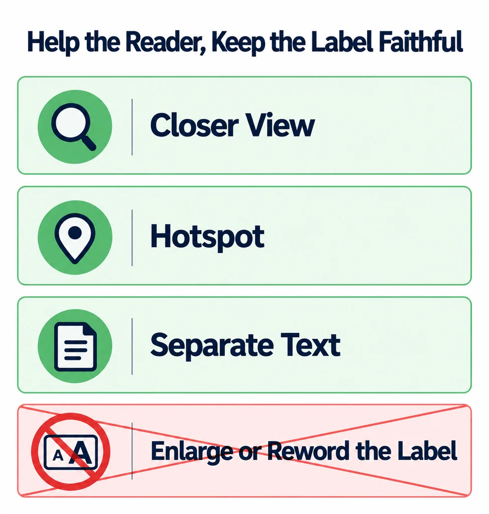
Do not enlarge the printed label or change its wording simply to make the default camera more readable. That changes the product representation. Offer a closer view, a hotspot, or separate text when the approved artwork cannot be legible at that scale.
Check whether reflections or lighting obscure the graphic. A material adjustment must preserve the physical finish rather than flattening it solely for readability.
Accept the result against named views and display sizes. Keep the source artwork, mapping decision, and sampling configuration with the asset revision. When the page layout changes, repeat the test because a smaller viewer can invalidate an earlier legibility decision.